
In the latest updates of Nintex K2 Five (5.6), the Style Profile Designer Developer Tab has been introduced. Style profiles allow you to easily change the colours of your forms by creating a basic style with three main colours. In addition, you can also configure advanced colours for K2 SmartForm controls such as text boxes, sliders, uploaders, tooltips, buttons, menus, charts and more. The themes are now called legacy themes. There are many other properties that you will see in your form.
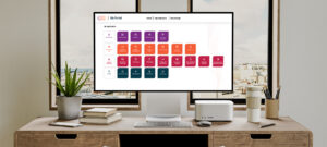
This article will help you understand this new feature of Style Profile and how it can improve the design of your existing Smart Forms. The new style profile provides a visual design experience for creating custom themes and styles that can be applied to any form. This allows you to standardise the look and feel of all applications to comply with the company’s brand guidelines or create a different look for each application built.
When researching how Nintex K2 developers design Nintex K2 Smart Forms, we discovered the following trends:
Designing individual controls is tedious and takes too much time to make each form look consistent.
Creating custom designs was possible but required a lot of CSS code and did not conform to modern CSS best practices.
Smart Forms branding is critical to the widespread use of automation applications in organisations, especially with external users.
To address these issues, Nintex added Style Profiles to allow form designers, and UX /UI designers, to easily design forms using modern standards like LESS variables. Nintex has taken the time to revise and modernise the CSS and has created variables that affect all Nintex K2 Smart Forms controls available in the designer. Furthermore, in the 5.6 release, Nintex focused on the colour-related variables that allow you to easily set main colours or control the colours of each control type in more detail.
In this scenario, we will create a Smart Form to which we will then apply a basic style profile and change the main colours. Finally, we will test the form to see the difference in styles.
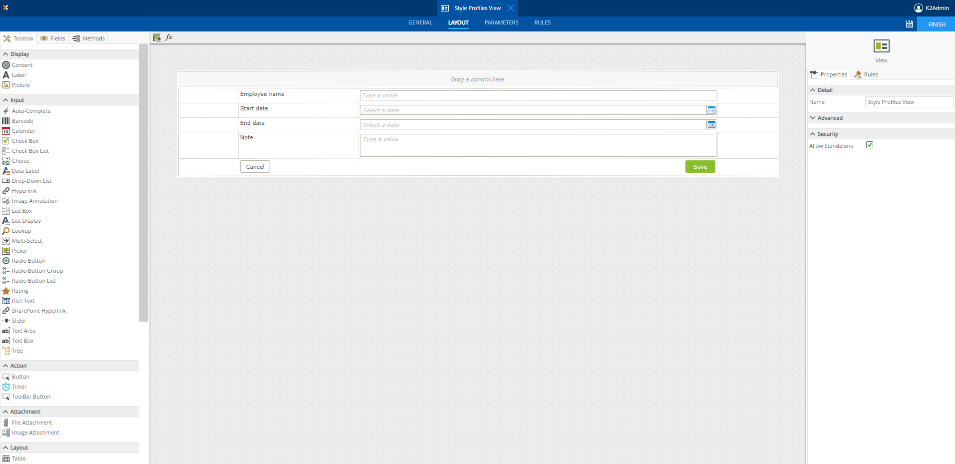
In K2 Designer, create a form with one item view to showcase the use of the style profiles feature:
Create a new category for this demo and create an item view.
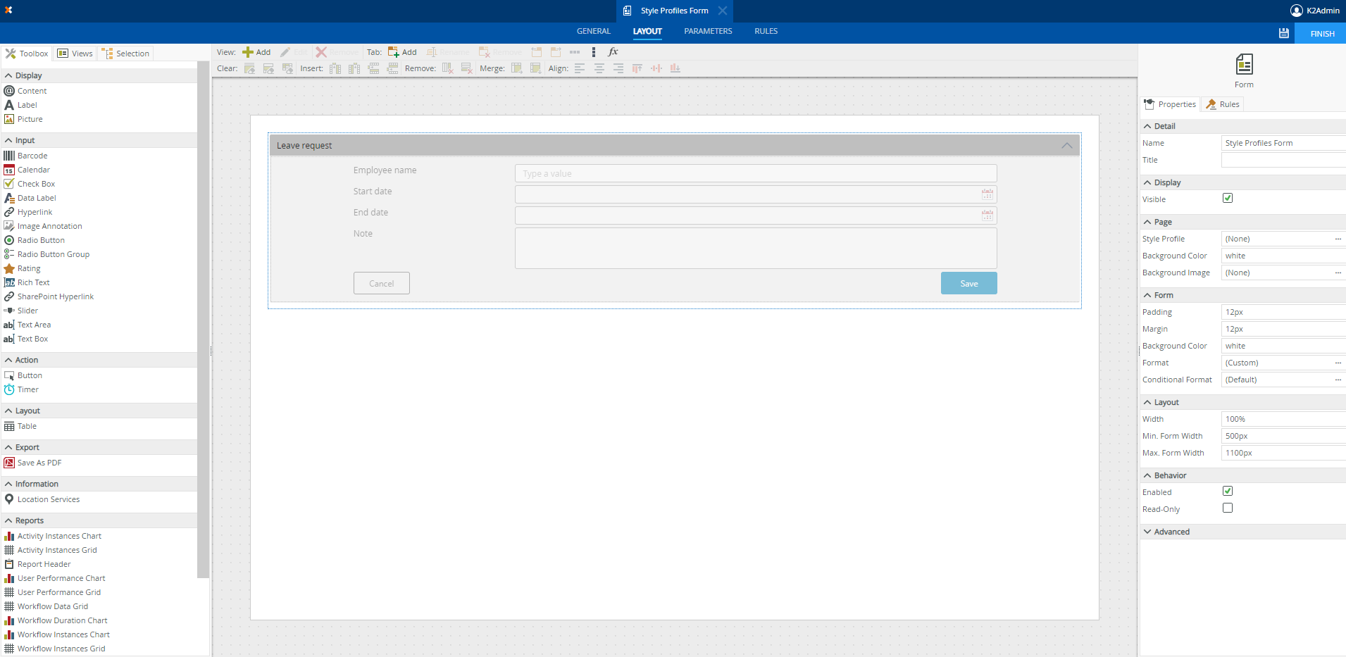
Fill in this item view with controls that you would like to have. In this example, we have used “Employee name” as a text box, “Start date” and “End date” as calendars, “Note” as a text area and finally Cancel and Save buttons.
Right-click on the created Item View and select Generate Forms.
Your design canvas should look like the image below. (Depending on your K2 version and the theme that you have selected, your form may have a different style and colour)
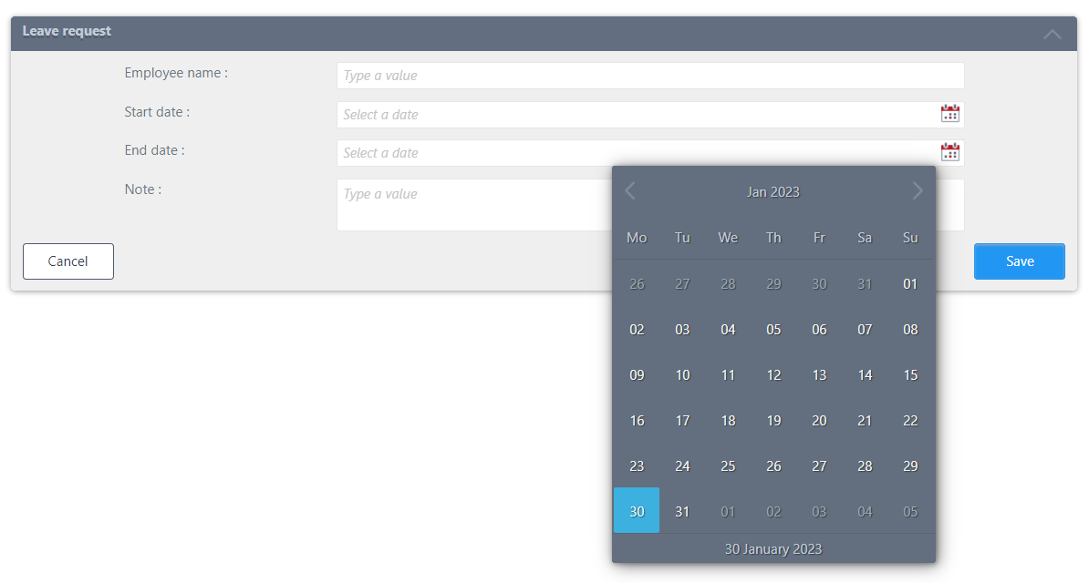
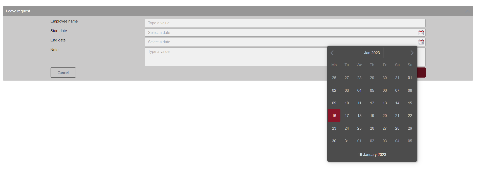
If you run the form without Style Profile. The form will look as in the picture below:
From the K2 Designer, right-click the Style Profile category and select New Style Profile.
Click on the main accent colour and then select a colour from the colour wheel by clicking and dragging the cursor in the selection area to highlight a colour. This is the colour you normally use for your main mark colour.
When you change the main colours, you should consider the following:
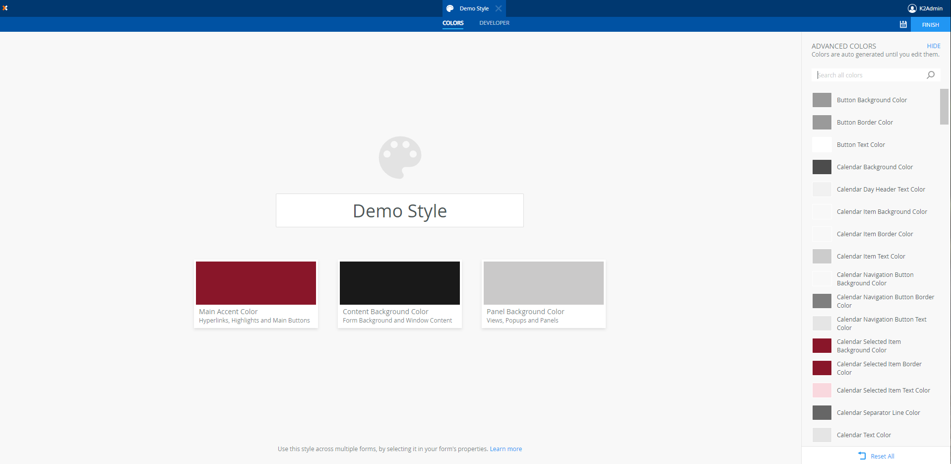
We can see the 3 colours have been applied to the form.
When you apply a style profile to a form, it may behave differently from what you expect. Take note of the effect other settings have on the behaviour of your form at runtime:
If you have any questions on the above or any other questions about Nintex K2, get in touch with our K2 experts!
